10 web accessibility tips for sustainable brand websites
- Sep 7, 2022
- 6 min read
Updated: May 12, 2023
Why sustainable brands should care about website accessibility
Let’s imagine you’re installing a brand new light switch in your living room. You have to decide where you’re going to install it. You wouldn’t choose to fix it to the ceiling, as only a few people would be able to reach it. It’s likely you’d choose to position it on a wall, about 1 metre from the floor so a large percentage of people can access it.
It would have a far greater level of accessibility. It’s accessible to tall people, to short people, to children, to wheelchair users and to many others. This is why the lighting regulations now require light switches to be within 45cm and 12cm from the floor: to make them as accessible as possible, trying to prevent discrimination.
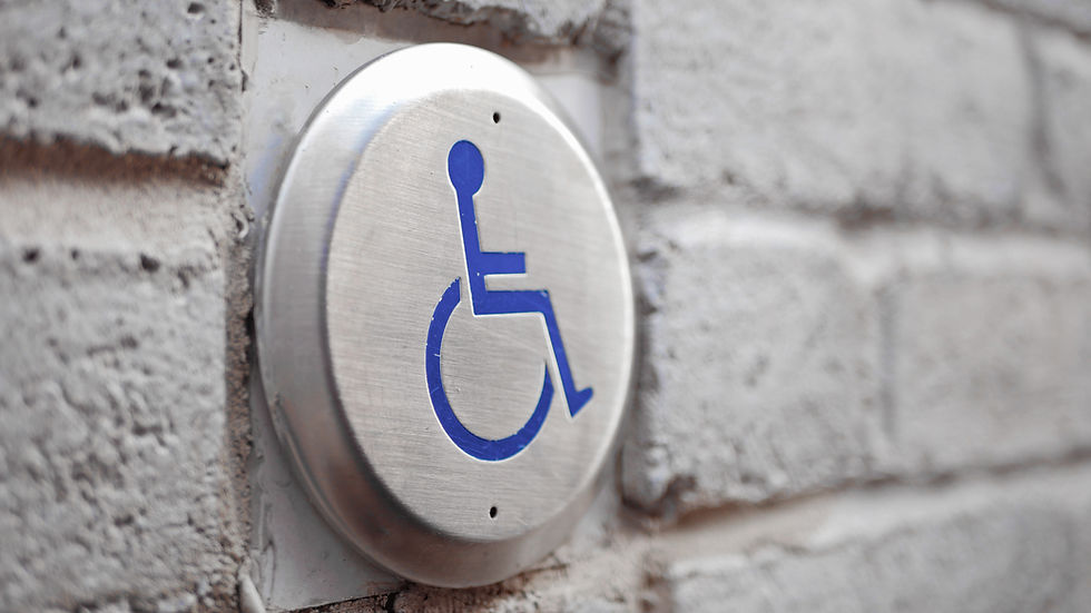
Globally, about 15% of the population live with a disability, and nearly 4% are blind or visually impaired. This is why accessibility standards exist for many products and services. Websites and digital products are regulated to help prevent discrimination. They’re called The Web Content Accessibility Guidelines or WCAG for short. In the UK, to meet government accessibility requirements, digital services must:
meet level AA of the Web Content Accessibility Guidelines
work on the most commonly used assistive devices
include disabled people in user research
These regulations provide a foundation for making digital products accessible to as many people as possible: it’s about broadening the reach of your product, service or community. This includes users with disabilities.
In the UK, US, Japan, and other nations, discriminating against users with disabilities could result with a lawsuit. As recently as 2019, Pizza giants Dominos experienced this first-hand when they were sued for discriminating against the blind after a user was unable to order food via their website or app using assistive technology.
So, in order to provide an accessible website or product usable by as many people as possible:
your content should be perceivable
your interface should be operable
your content should be understandable
your product should be robust
In this article, we share 10 tips on how you could incorporate this into your design thinking processes to make your website accessible.
#1: Test and test again
As with any form of design, empathising with your users provides the foundation for their adoption, engagement and retention. Web accessibility design is no different. User testing provides the depth of insights you need. There’s no need to wait until the end of your design lifecycle: test early and frequently so you can learn early and often.

Web accessibility checklist
Test with users with assistive technology
Test with visually impaired users
Test with cognitively impaired users
#2: Don’t rely on visuals alone
It’s often said that a picture says a thousand words. This is, however, only true for those of us who have the luxury of good sight. We therefore need to describe visuals so that the same information can be consumed in different ways.

Web accessibility checklist
Keep hyperlinks underlined and keep them blue
Describe your visuals with aria-labels and alt tags
Ensure you have a colour contrasts of at least 4:1
#3: Don’t use PDFs for digital content
The Portable Document Format (PDF) has been around for a long time. It was created as a medium to design for printing. It wasn’t built for the intention of being read online. It’s linear and limiting, with unnavigable content, and sized for paper not screens. Assistive technologies are therefore unable to provide the same level of experience as they would for digital material where these characteristics are inherent.

Web accessibility checklist
Use PDFs online sparingly
Use PDFs for printing
Use hyperlinks within PDFs to ease navigability
#4: Utilise semantic markup
HTML has evolved a lot since its invention. We’re now able to build webpages using a broader set of elements, with a broader set of semantics. This gives us the advantage of being able to add implicit meanings behind the objects on page, allowing assistive technology to convey richer information to users.

Web accessibility checklist
#5: Provide shortcuts
Most pages of a websites are designed with a common architecture. This is good design. Our eyes naturally gravitate towards the centre, or body, of the page where the content resides. We can skip the comment elements like navigation and refer back to them when we need to. However, it’s not quite so easy for assistive technology to interpret what is and isn’t content that can be skipped. There is no virtual eye that can gravitate to the page body. So assistive technology has no choice but to go through everything each time. We need to provide shortcuts for our users to skip common content.

Web accessibility checklist
Include a “Skip to menu” CTA at the top of every page
Include a “Skip to content” CTA at the top of every page
Utilise keyboard shortcut conventions such as Ctrl+S for Save, or Ctrl+C for Copy, ESC to close, etc
#6: Support keyboard only navigation
When you’re signing in to your favourite online app, you may choose to press enter after entering your username and password, rather than using your mouse to click the login button. Some users prefer to use a keyboard to speed things up. Some users have no choice and can only use a keyboard. It’s therefore important to ensure that you support cases for all input devices.

Web accessibility checklist
Provide a consistent focus style for actionable elements on the page
Use tab index to define the order a user can tab between content
Try to keep the user in the same browser tab
#7: Support personalisation
Users will find it easier to consume your content if you adapt to their personal preferences on how they consume content. This allows users to focus their cognitive energy on the task at hand, rather than having to learn how to conduct the task at hand. Some users find it easier to consume different content of colour palettes, font-sizes and suchlike, particularly by those who suffer from forms of colour blindness.

Web accessibility checklist
Provide dark/light mode alternatives
Support zooming up to 200%
Don’t auto-play content like videos
#8: Use descriptive markup
We often take it for granted that if something looks like a button, then it’s probably a button. It makes sense to us, and it’ll often result with a relatively small cognitive load. This simple example extends to input fields, navigation, and in fact, most UI elements. For those who rely on assistive technology however, it’s not quite as simple where these elements don’t have a “look” of a button or input field. To cater for this, we can add special descriptive attributes (like aria and role) to our markup, to mimic the UI “look” for assistive technology. This means that assistive technology users are more likely to understand the purpose of UI elements.

Web accessibility checklist
Use the role attribute to explain an element’s purpose
Use aria-current to explain currently selected elements
Use aria-haspopup to explain that actions results with dialogue modals
#9: Keep forms simple
Forms are the typical method for users to input data. They can comprise a range of data types, formats, and styles. Web browsers have become quite clever in helping users complete forms. This is not by pure luck; this is by the markup defining the purpose of each input field. If the browser knows that a particular input requires an email address, then the browser can autosuggest all previously entered email addresses. The user can then select their email address from a list, rather than having to enter in manually. The same extends for date of birth, telephone numbers, addresses, and any other standard entry type – there are 50+ definitions of such standard data.

Web accessibility checklist
Use attributes to empower autofill
Do not use placeholders; use labels and hints
Only ask for relevant information
#10: Keep it simple
To cater for the differing levels of education and literacy, you can broaden your reach by minimising the level of language you choose to use. Imagine a user who’s 6 years old; it’s likely they’d have a lower level of comprehension than a user who’s 42. Similarly, users with cognitive disabilities may have differing levels of comprehension and literacy. It would be great to use language that everyone can follow and understand.

Web accessibility checklist
Use the Flesch-Kincaid readability tests to measure language simplicity
Keep copy concise, relevant and precise
Try to avoid jargon but explain it when you do
Summary
So when you're building your next digital service, embed accessibility into your design thinking process from the ground up. It's part of usability after all. Please do remember, though, that applying these tips alone will not deliver an accessible service and it's important to apply the complete specification to your service.
Good luck in your future endeavours to be more inclusive with your designs, and empathising with your users. Remember, The C Collective are always here to offer advice, support and consultation. You can get in touch via our website, LinkedIn or Twitter.


Comments